Spring Release 2026
Innovated. Built for impact.
Explore the new ways to collaborate, analyze, and act on your data.
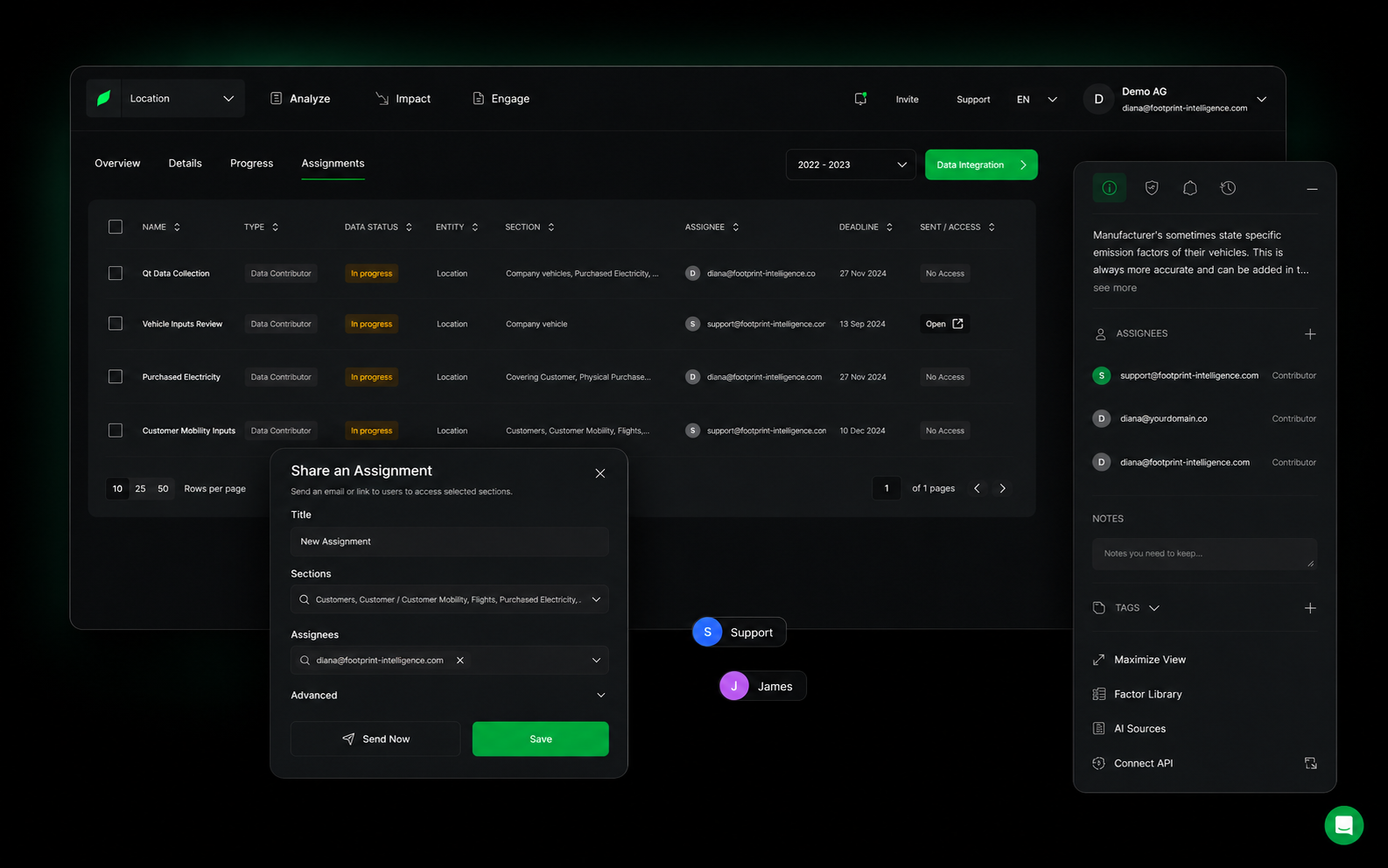
Assignments
Assign work. Track progress.
Assign responsibilities, track progress, and keep data collection moving across teams.
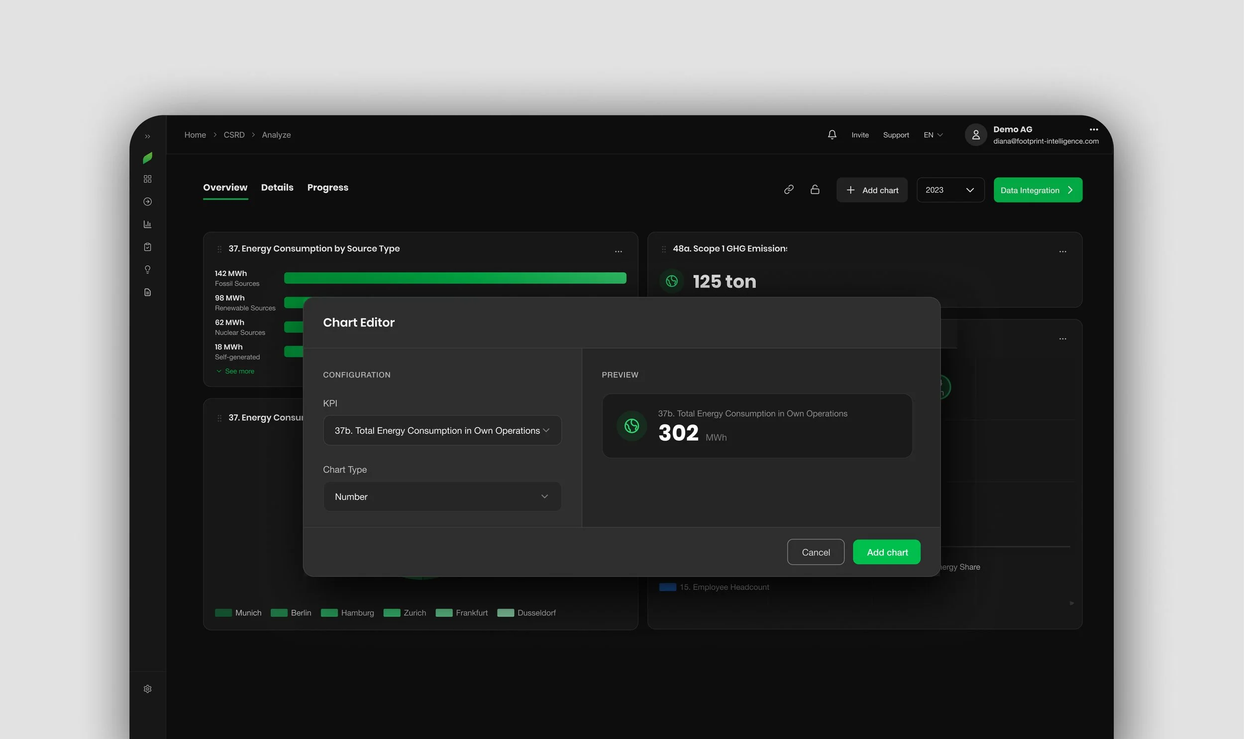
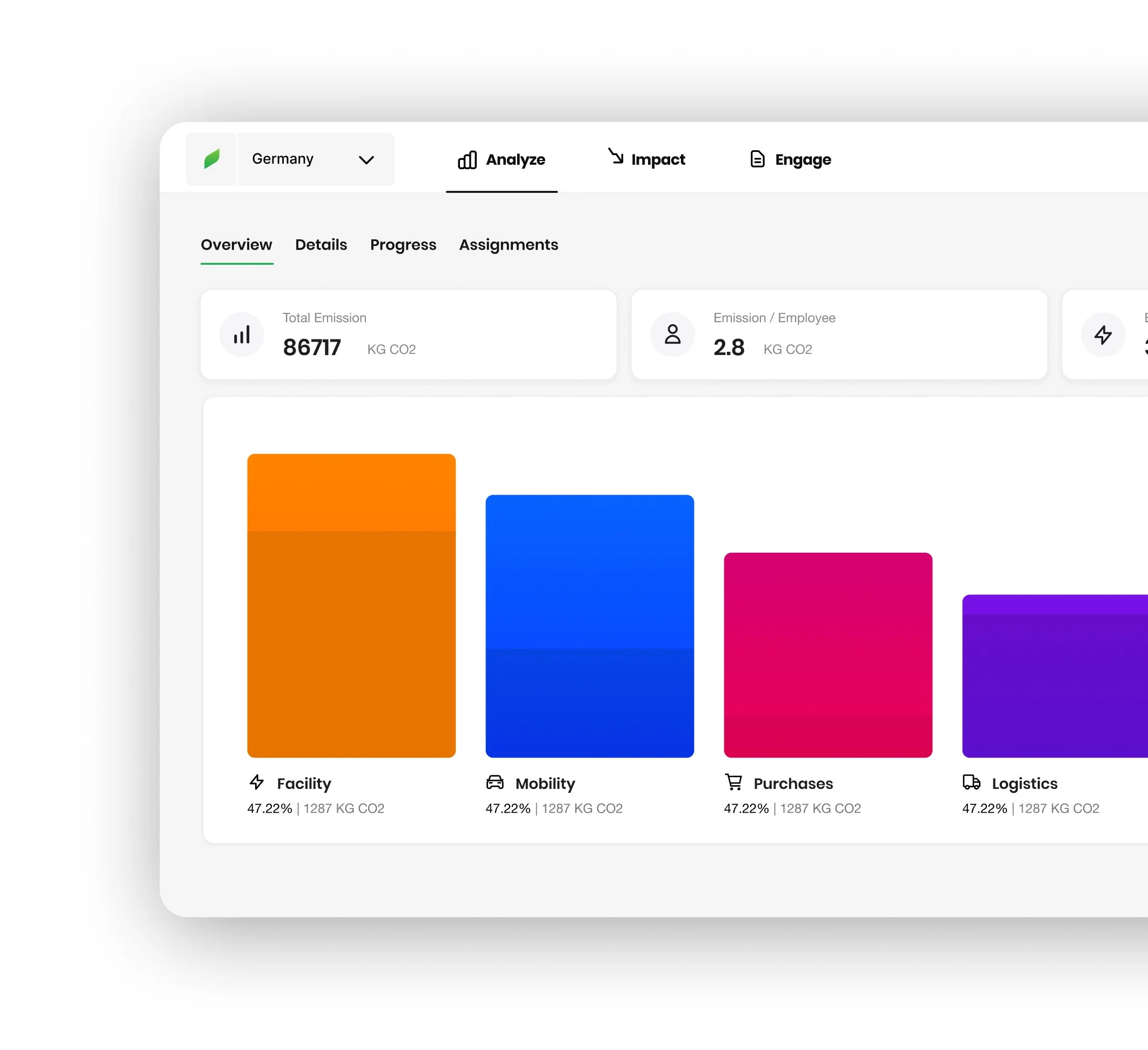
Visualizations
Analyze with more flexibility
Create custom charts for the metrics that matter.
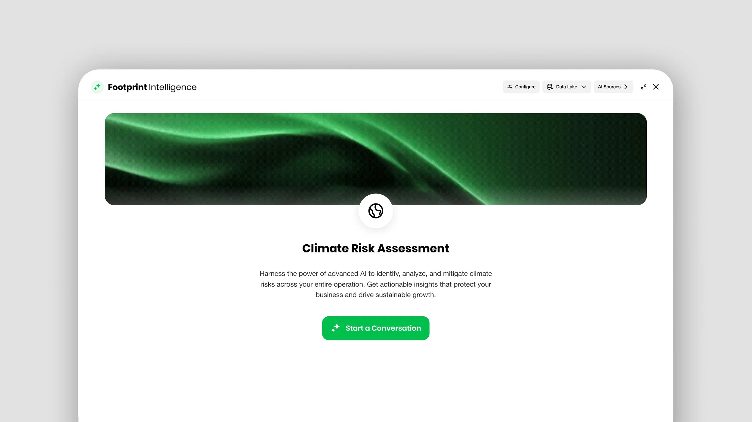
Agents
Specialized AI agents support ✦
Use dedicated agents to support complex sustainability workflows — from climate risk and compliance topics to questionnaires.
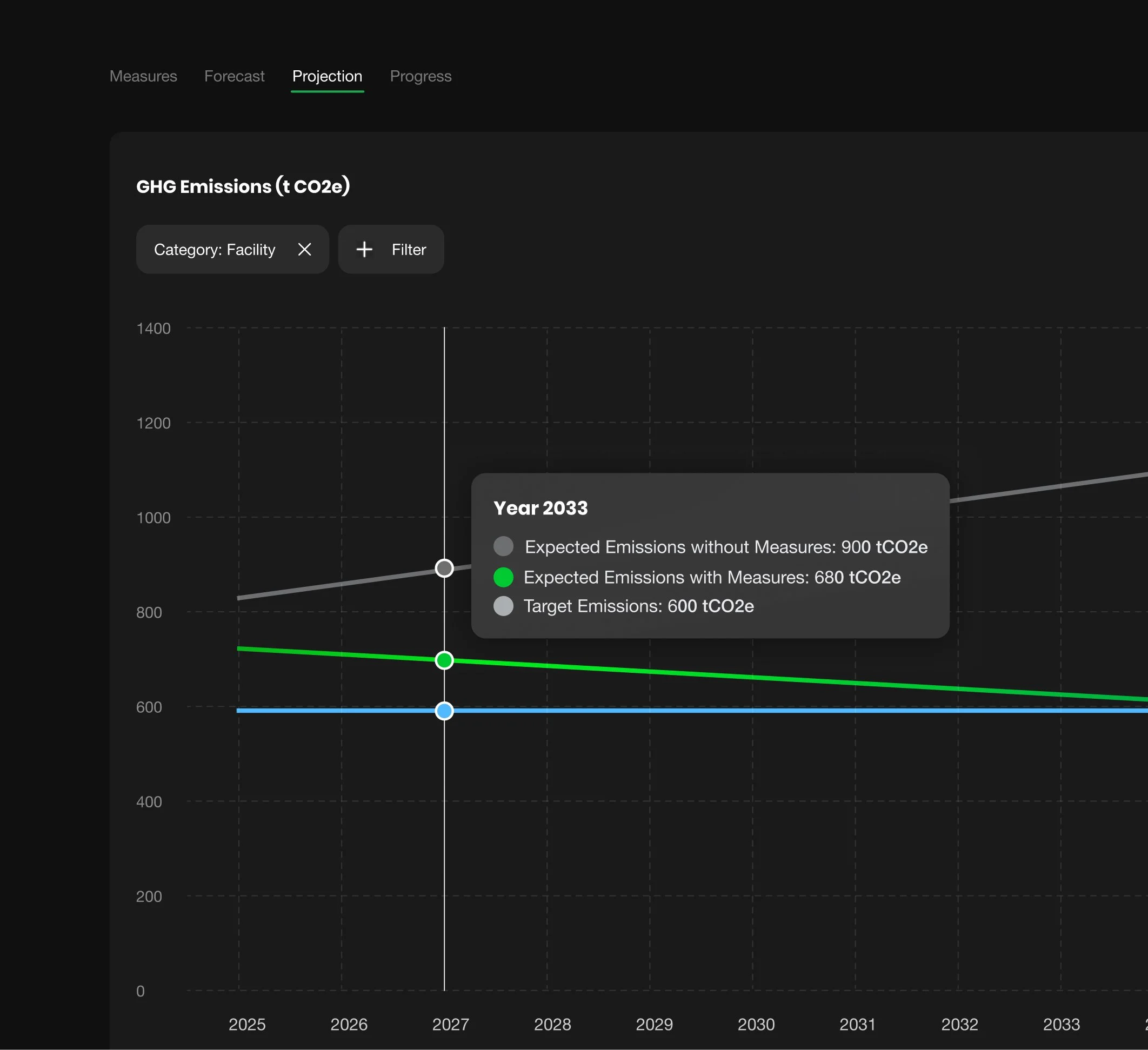
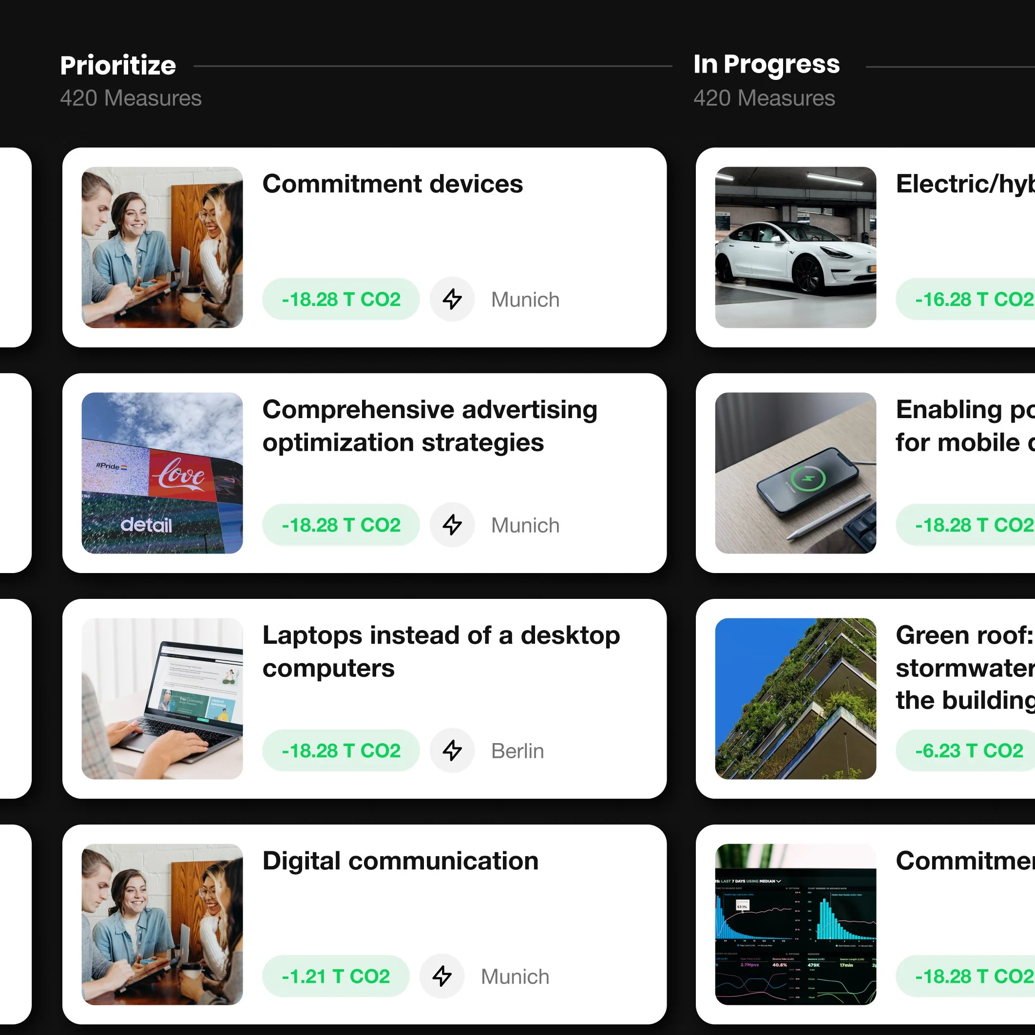
Smart decarbonization
Plan measures with confidence
Forecast the impact of decarbonization measures, understand future cost, and access an expanded set of actions to support your strategy.
Interface Update
Meet the new Light Mode
Switch between dark and light mode to match your preference and working style.

12+ more improvements
It doesn’t end there.
Experience the best of spring, with more updates coming this season.
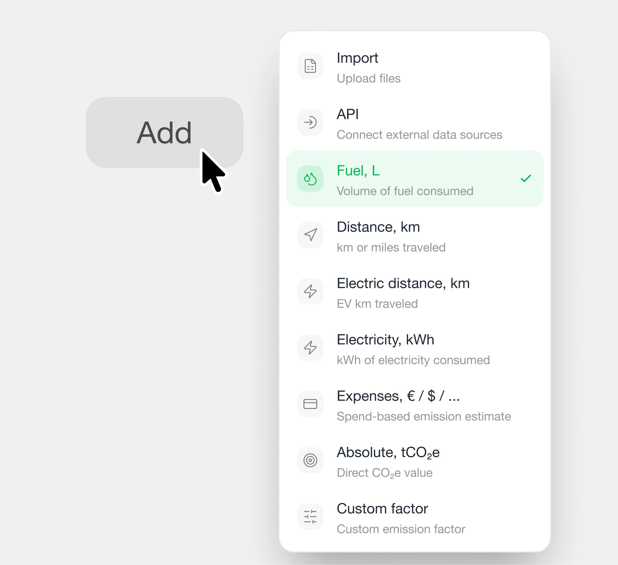
Upload data with more flexibility
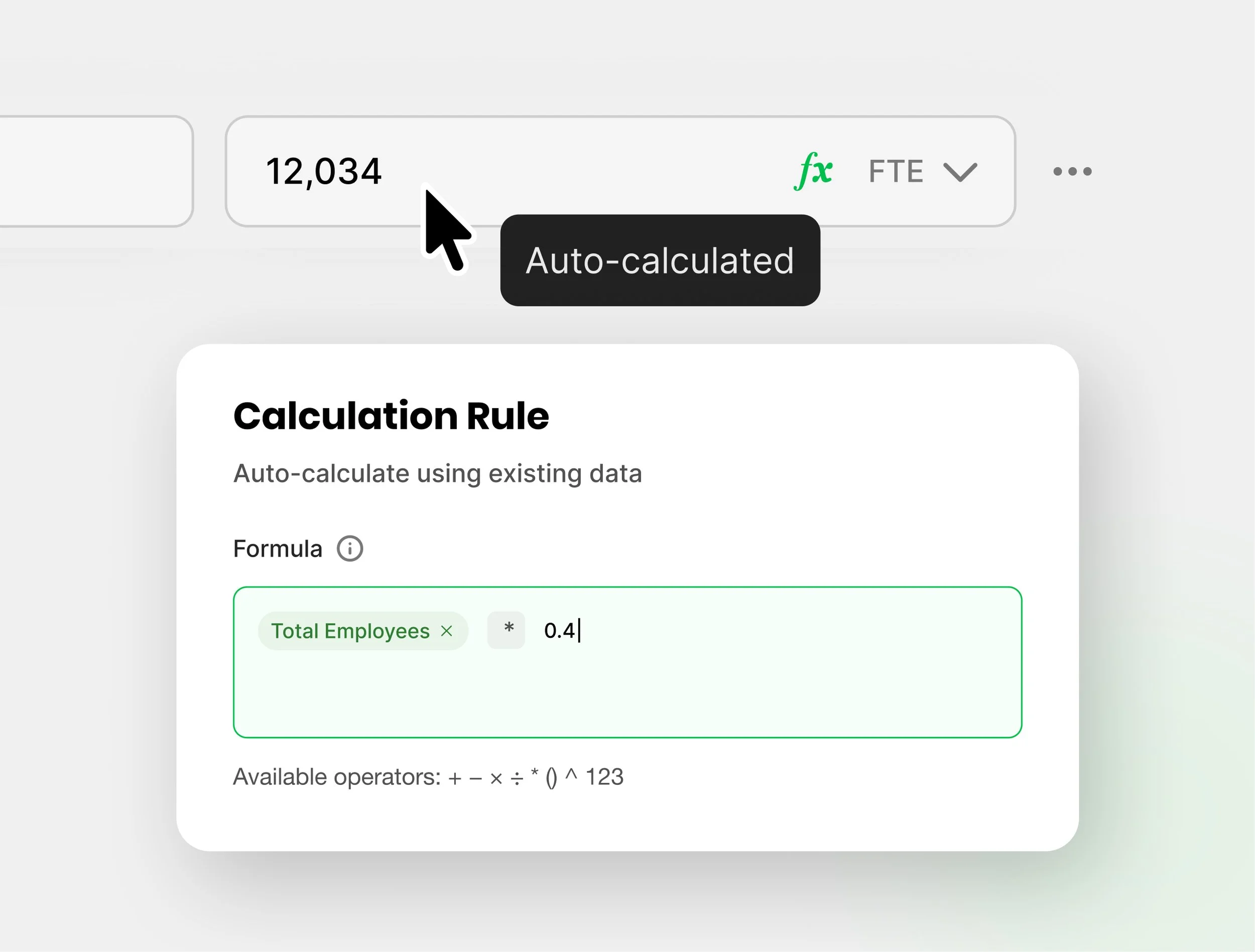
Automate recurring calculations
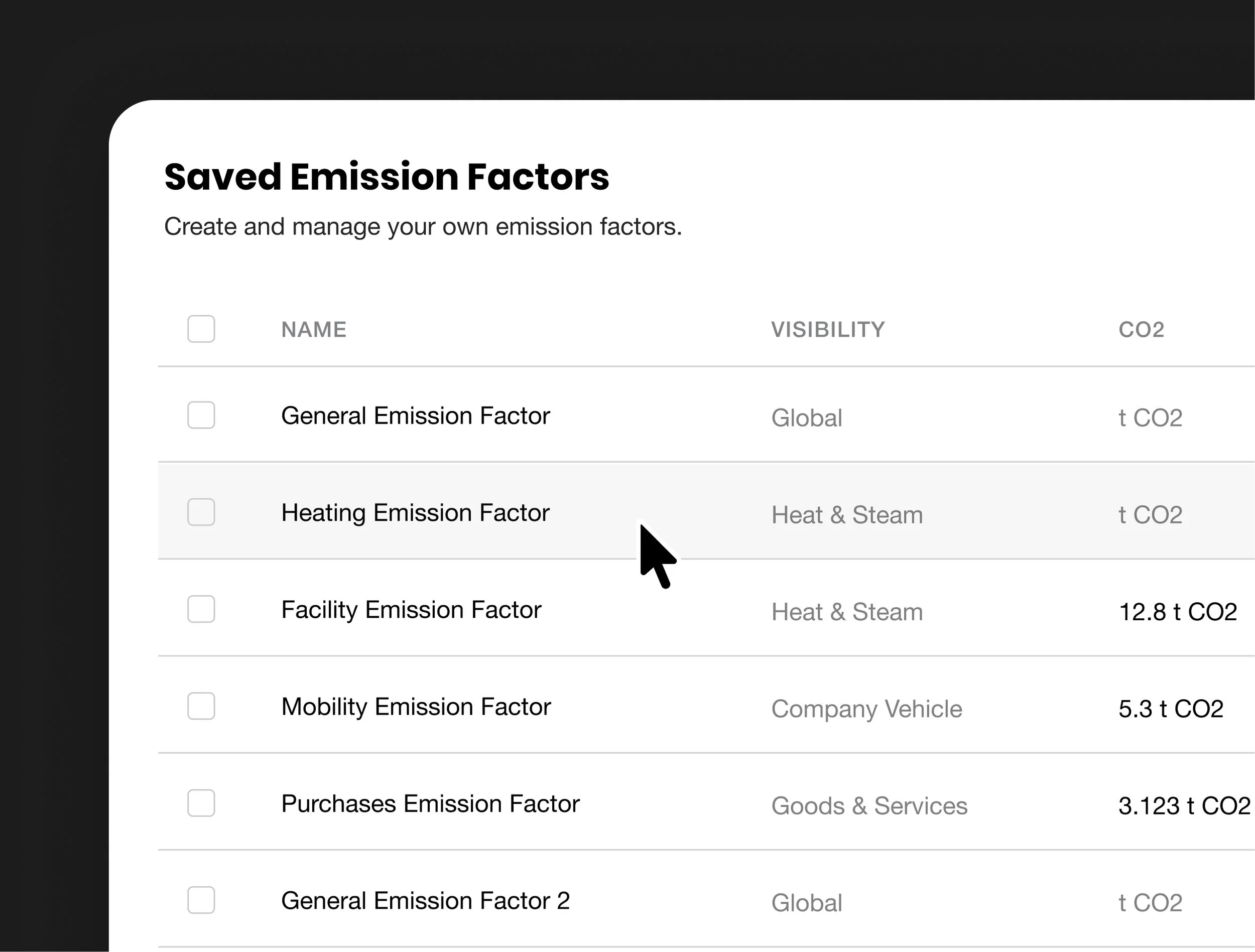
Manage custom factors in one place
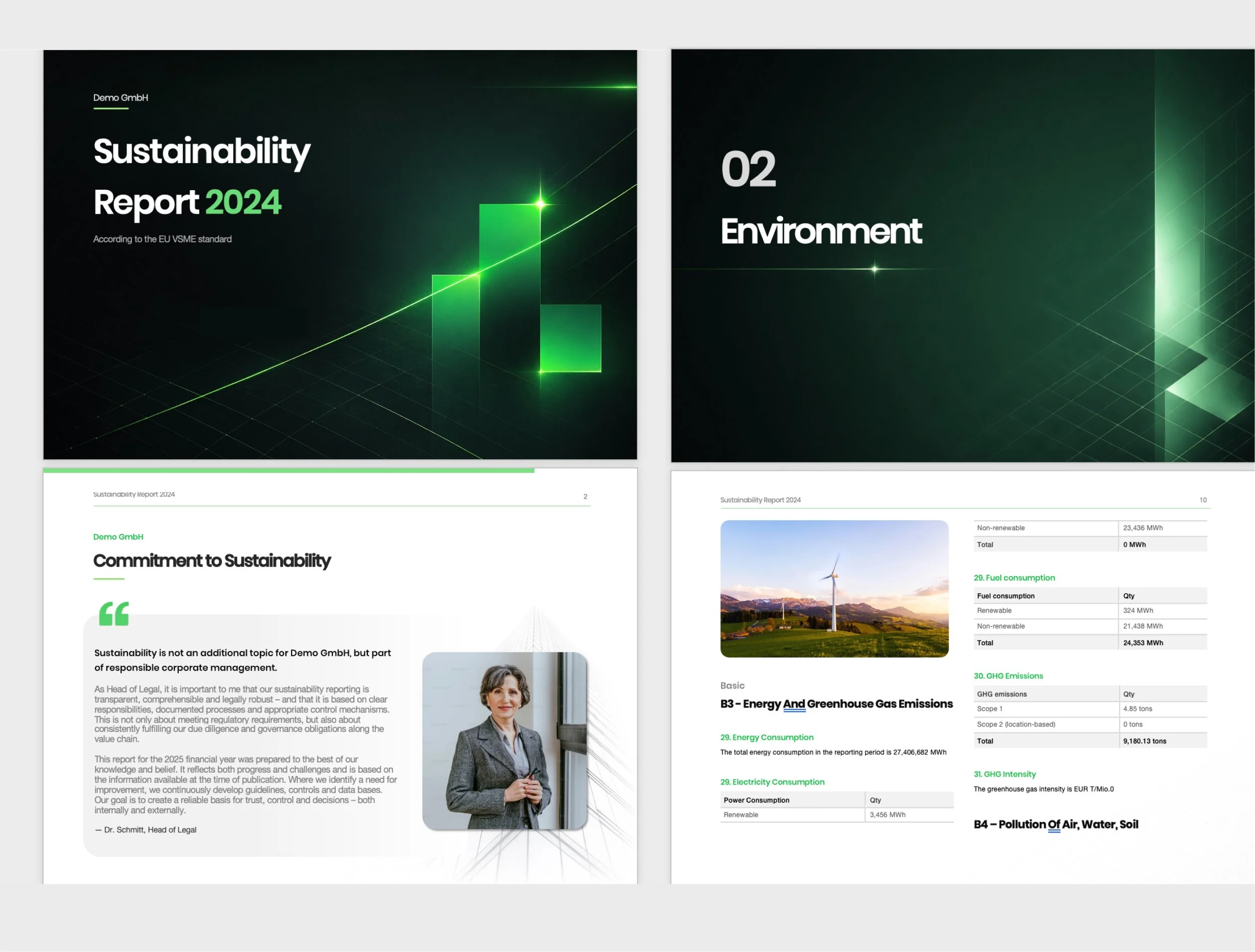
Updated sustainability report templates

Sustainability, where it meets innovation.
